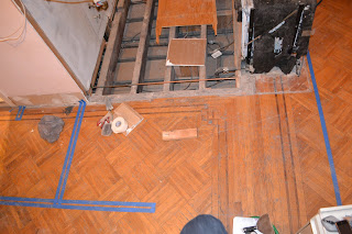
We are in the process of procuring all the elements for our renovation. It should be a short schedule - only 4-6 weeks and we have to be prepared with everything we are providing which has meant we've had to make lots of decisions pretty quickly. Below is what the kitchen *currently* looks like:
Don't worry - the ladder is just access to the attic - it's not down most of the time. Also, the pink is nice, no? We debated about keeping it, but then decided to go with a warm grey. We used Ikea's Kitchen planner that I've enhanced a little bit with photoshop for a schematic view. Our dining table will be in front of the fire place and the sofa and lounge pieces will facing the opposite wall.
1. The lower cabinets are going to be Ikea Nexus in dark brown. Dark finishes hide dirt and baby fingerprints... always a good thing! I also like that the wood grain will run horizontal. Add some subtle texture. We also found beautiful pulls from Mockett.com in a "black chrome" finish. They ad a bit of sparkle without standing out too much.
2. Our counters will be Caesarstone - light and airy, but with some texture. Most importantly easy to maintain. We like the look of thin counters so we are using the slabs that are only 3/4" thick. The thinner slabs are also about 20-30% less money! The color we chose was 4600 "Natural White". We are now coordinating with an installer to see if we will need a boom to get the 9' slab into our apartment. We are testing out the size this weekend to confirm it will fit in our stair well (thankfully the ceilings are high!).
3. The upper cabinets will be the Ikea Akurum Abstrakt white lacquer finish. Don't think we'll need pulss, but if we do, we'll do a similar edge pull in a chrome finish from Mockett.
5. The light fixtures are by Tom Dixon and we happened to find them for a deal on ebay. We have one of each of the shapes below. The inside is hammered brass and the outside is black spun metal. We got them this week and now I am on the fence ( I know I don't have time to be on the fence). We now kind of like
these new pendants from West Elm. They would add a bit more sparkle. We mignt now do a cluster of the three Tom Dixon lights in the "office" area (get a new canopy that can accomodate the three lights). Will keep you posted!
6. The flooring we chose was rubber tile from Nora. It is resilient, easy to maintain and adds texture with the round dots. I love that it is a sustainable material as well as "honest." We had considered doing porcelain, but the height difference between the surrounding wood floors and the tile would have been a more expensive problem. This rubber is thin, so the transition will be easy with the new subfloor. Also the grey will break up the dark floors and the dark cabinets (excuse the bathroom picture below - turns out rubber floors in bathrooms is a common thing in Europe).
The backsplash will be white 3" x 6" subway tile with grey grout and we got the kitchen sink and faucet from Signature Plumbing. I am so excited to have a double sink! Last time I had one was over 12 years ago when I was living with my parents. I also love that the faucet has a pull out spray - easier access to those two sinks!


